Coming soon
Coming soon
內容整理中:不可點、顯示佔位圖與徽章。
Design System
這個作品集本身就是一套小型設計系統:所有頁面只用這裡的 token 與元件組成。
--color-primary--color-primary-soft--color-accent--color-warm--color-success--color-text--color-text-muted--color-text-subtle--color-bg--color-surface--gradient-brand--text-displayDisplay 標題
--text-4xlHeading 4XL 區塊標題
--text-3xlHeading 3XL 章節
--text-2xlHeading 2XL 卡片標題
--text-xlText XL 導言文字
--text-lgText LG 內文強調
--text-baseText Base 內文:從品牌到介面,讓每個接觸點都說同一種語言。
--text-smText SM 輔助說明
--text-xsTEXT XS LABEL
--space-1--space-2--space-3--space-4--space-6--space-8--space-12--space-16--space-24--radius-sm--radius-md--radius-lg--radius-xl--radius-pill--shadow-sm--shadow-md--shadow-lg--glass-shadow滑過下方軌道看各時長與曲線。系統設定「減少動態」時全部歸零。
--dur-fast · --ease-out--dur-base · --ease-spring--dur-slow · --ease-out模糊+飽和+漸層高光邊+柔影。
文字密集時提高不透明度。
hover 浮起、游標高光、微傾斜、按下回彈。
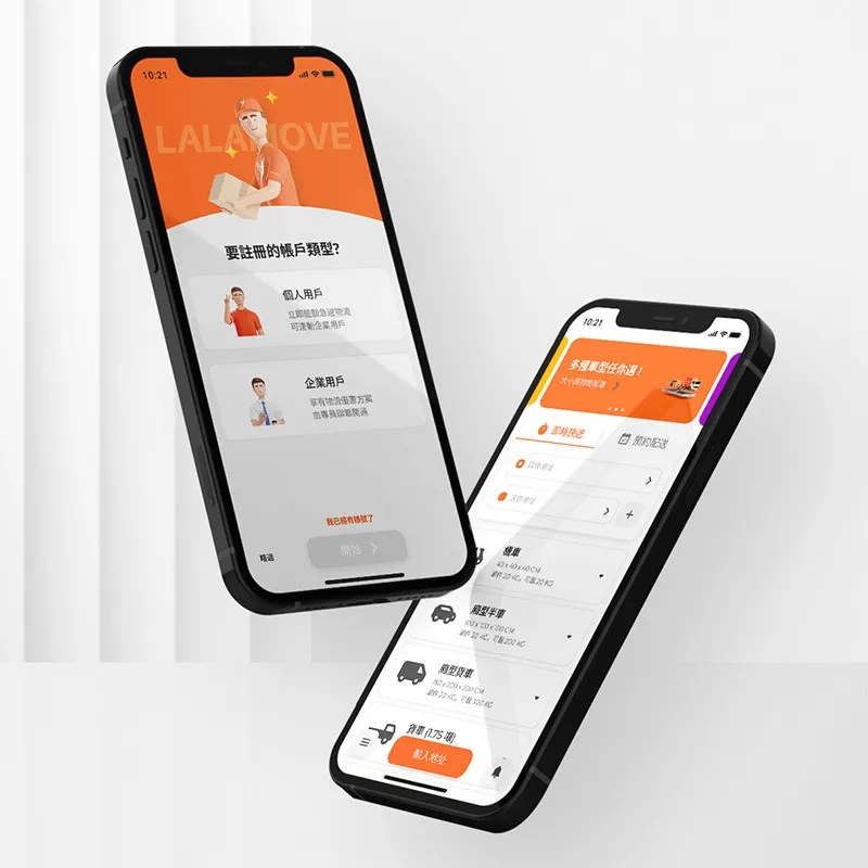

可點擊:封面放大、箭頭推移、卡片浮起。
內容整理中:不可點、顯示佔位圖與徽章。
內文可用 這類記號插入行內圖示。
每個說明條列共用同一種編號樣式。